They’re All Here: Paint Colors of the Year for 2017
Eric Broermann December 29, 2016
Eric Broermann December 29, 2016
Color-management company Pantone Color Institute recently announced its Color of the Year for 2017, a vibrant spring-green hue called Greenery. If you’re among those who find Greenery a bit too bright to be used in or on your home, take heed. Paint manufacturers have chimed in with their various selections for Color of the Year and, for themost part, it’s a much mellower bunch. Deep grayish blues and purples dominate, but some warm neutrals and bold yellows are also offered up.
It’s worth pointing out that homeowners are in no way expected to change the color scheme of their home with each passing color trend. Where these selections can be useful, however, is when there’s a particular color being touted that you really like. It becomes much easier to find furnishings and decorative accessories that coordinate with the favorite hue because it’s trending.
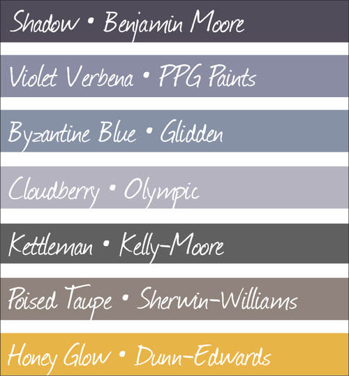
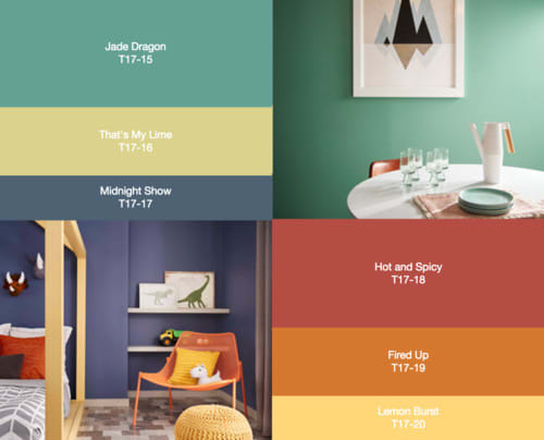
Shown here are the various 2017 paint colors of the year, from top to bottom: Shadow, from Benjamin Moore; Violet Verbena, from PPG Paints; Byzantine Blue, from Glidden; Cloudberry, from Olympic; Kettleman, from Kelly-Moore; Poised Taupe, from Sherwin-Williams; and Honey Glow, from Dunn-Edwards.
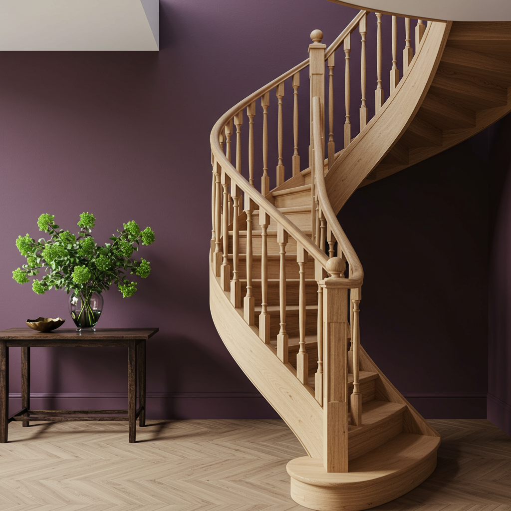
Benjamin Moore’s selection, Shadow, is a deep, dark purple-gray hue that’s quite a shift from its 2016 choice, Simply White. I think it’s a beautiful hue, but it needs to be used with care as it can easily make a space go gloomy. Using it in small doses or in spaces we don’t tend to linger in, such as a stairway, can add a nice dash of drama to a home without bringing everyone down.
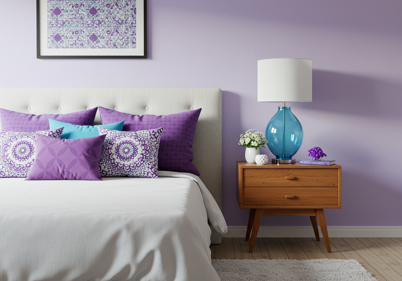
If Shadow is too shady for you, give PPG Paints’ Violet Verbena a look. It’s also a purple-gray hue but one that’s much lighter and brighter. It’s not a pastel but has a soft, soothing vibe nonetheless. I think it’s a terrific color for a bedroom or other space where a peaceful, easy feeling is desired.
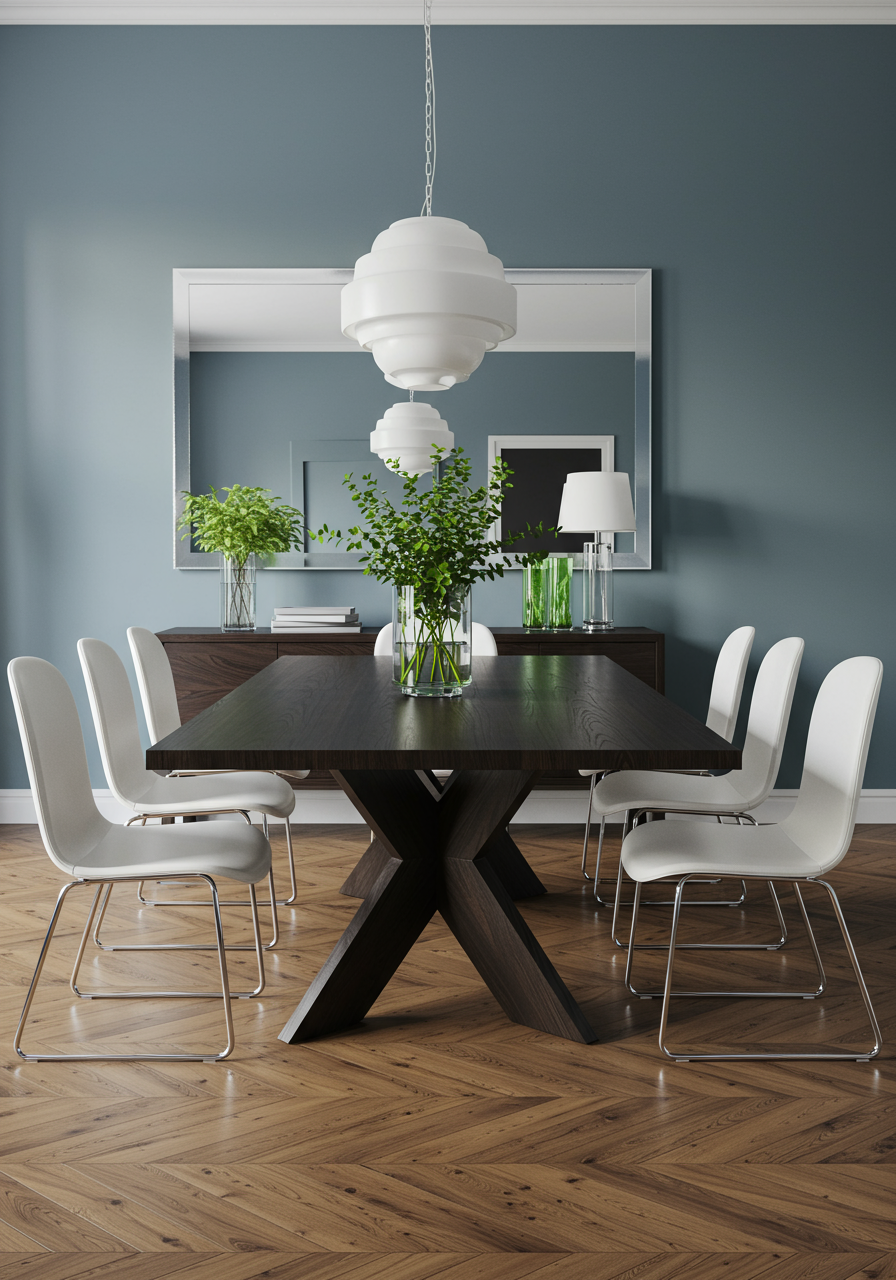
Glidden’s pick, Byzantine Blue, is also a purple-gray, but this one has a bit more blue in it than the others. It has a neutral quality due to the heavy dose of gray it has, so it works well with lots of other hues in a home.
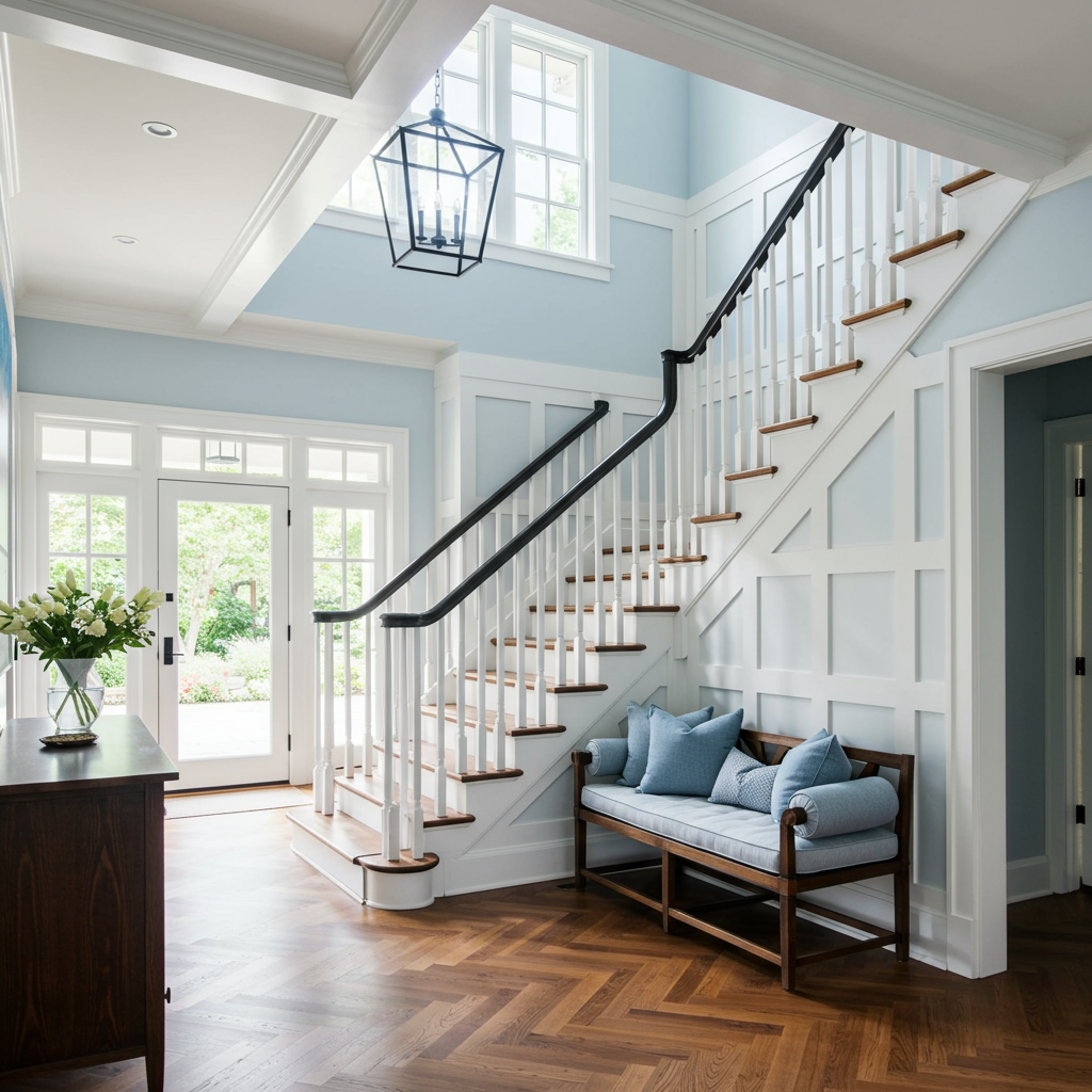
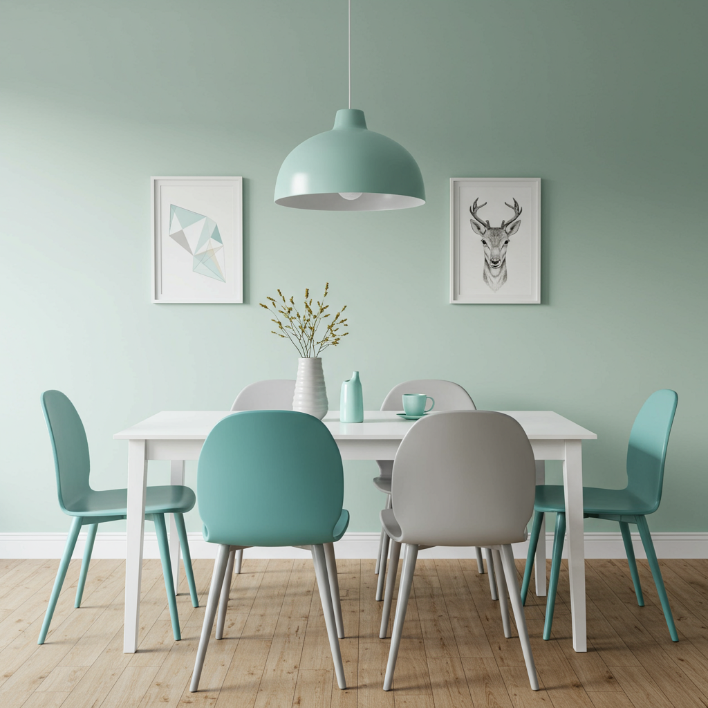
Olympic goes even lighter and wispier with its selection of Cloudberry. Again, the addition of gray here keeps it from going pastel, so it’s a nice choice in a bedroom, whether it’s a kid’s room or the master suite.
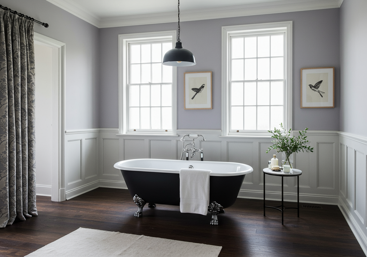
For those who prefer strict neutral hues, Kelly-Moore is offering Kettleman as its choice for 2017. It’s a dark gray that has a touch of warmth to it, perfect for those who find true gray too chilly. Like Shadow, it’s a rather dark color, so it needs to be used in small doses or paired with plenty of contrasting light hues.
Sherwin-Williams’ choice of Poised Taupe is actually one of my go-to deep neutrals. In my color consulting business I’m seeing a bit of a homeowner revolt against the cool gray hues that have been so popular the last few years, but they aren’t exactly embracing beige again, either. Taupe — essentially a cool medium brown — is the perfect compromise between warm and cool.
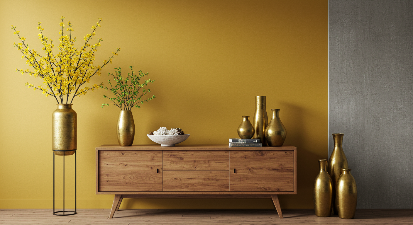
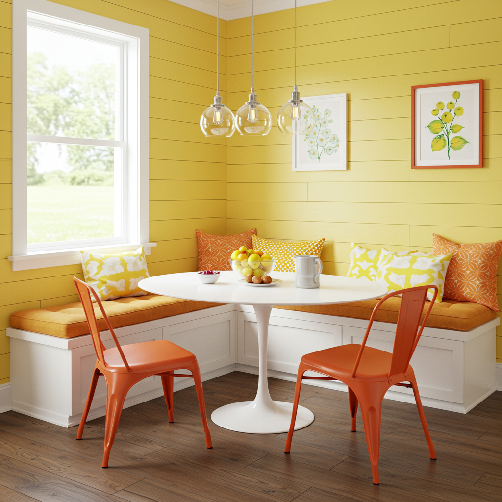
Honey Glow from Dunn-Edwards is like a burst of sunshine amid the cooler, moodier hues from the others. It’s a happy, welcoming hue that works well in a kitchen, living room or on the front door.
A couple of paint companies are promoting a slew of colors for 2017, rather than just one. Behr has chosen 20 hues that are divided into three categories: Comfortable, Composed and Confident. As a lover of bold color, I am most drawn to the Confident palette, shown above. Think about using these saturated colors in smaller doses, such as for an accent wall, in a niche or on the ceiling only, rather than on all four walls in a room.
Valspar has put forth a mix of neutrals and bolder hues with its 12 selections for 2017’s hottest hues. One of my favorites of its neutral offerings, Soft Silver Sage, is shown above.
Among Valspar’s bolder color choices, I love the warmth and vibrancy of Here Comes the Sun, shown on the walls above.
Your turn: See anything you like? Which color is your favorite? Tell us in the Comments.
Source: houzz.com

October 3, 2024
New Eligibility & More Changes: Oct 2024

September 3, 2024
It's not just about the rate!
April 3, 2024
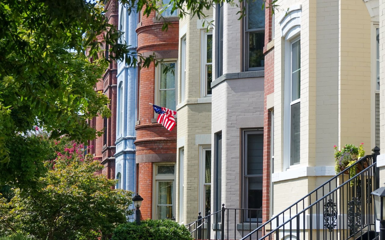
A quarter of a century ago, Washington DC had a fearsome reputation for crack abuse and rampant gun violence.
April 3, 2024
It’s important to figure out which shade will complement the furniture and textiles.
April 3, 2024
Let’s take a look at when paint works, what colors of paint to use on your cabinets.

March 14, 2024
Each State has slightly differing MCC eligibility guidelines and requirements, such as.

March 14, 2024
What initially seemed like a relatively straightforward final vote on a bill to regulate and restrict home-sharing services.

March 14, 2024
The company is so close to making its choice that Crystal City’s top real estate developer.

January 26, 2024
A question that almost every prospective client asks us is how we handle evictions.
Get assistance in determining current property value, crafting a competitive offer, writing and negotiating a contract, and much more. Contact us today.